Ashima Divine City, Bhopal · Design development
The Shrivastava Residence
A Jodi Flat shaped by a lotus painting, with colour for gathering and quiet rooms for rest.
Start a project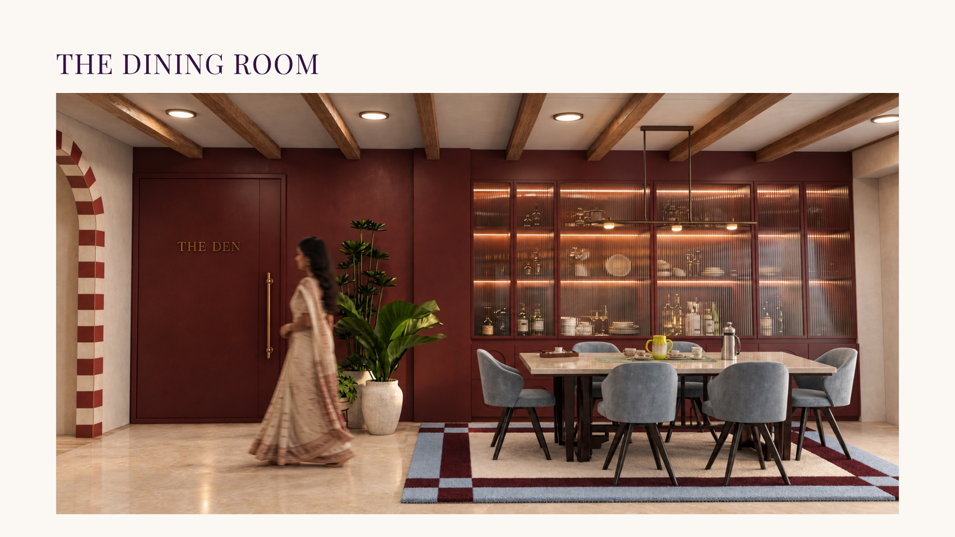
Discovery before the design.
Our client, a retired IFS officer, wanted nature to blend with the interiors: a home that felt breathable yet dramatic. We began by understanding what felt personal to him and his partner, before translating that into rooms.
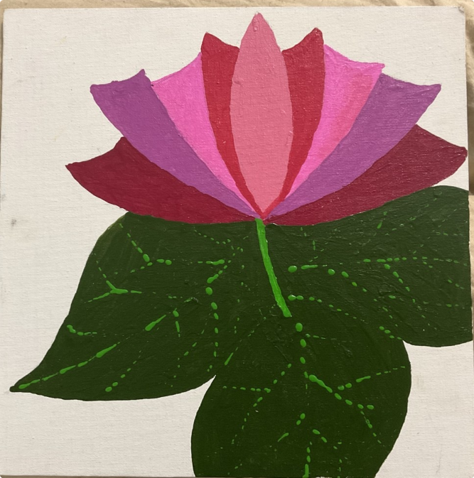
Persona Mapping via meditation & then a painting.
After a meditation session, we invited him to paint anything he liked. He painted freely, giving us a starting point for a conversation about colour, nature and the space he wanted to live in.
We also observed the colours and materials of the clothes the couple wore. Together with their conversations and the painting, these everyday preferences helped inform the home’s palette and material direction.
Reading the painting.
We read four qualities in the canvas as design cues, not as a personality test. These observations shaped our interpretation of a home with vivid colour, room to breathe and places for stillness.
One subject
A single lotus, almost in profile, holds the composition without a surrounding landscape. We took this as a cue to give each space a clear focus.
Colour as identity
Each petal carries a distinct colour, with clear edges rather than gradients. Our interpretation gives colour defined places in the home.
Space left empty
Large areas of canvas remain untouched. We translated that breathing room into quieter surfaces and restraint around the stronger moments.
Patient repetition
The leaf veins carry repeated, intricate marks. They suggested a measured rhythm of detail rather than ornament everywhere.
Walking through the lotus.
The painting becomes a home.
A lotus painting gives this home its organising idea. Its bloom, leaf, stem, water and untouched canvas become different room moods. Design development brings the family’s daily rhythms and return-home needs into that idea, balancing places for gathering with spaces to observe, pause and rest.
- Bloom
Living, study, powder and dining
Wine, maroon and ink carry the painting’s petals into the rooms for gathering.
- Leaf
Video room
The deep green mass becomes an enclosed evening room.
- Stem
Kitchen
Nourishment connects the house, with maroon softened to a single thread.
- Water
Family room and puja
Daily rituals create a still centre between activity and rest.
- Canvas
Bedrooms and baths
Pale blue and sage leave room for calm.
The moodboard: rich, but edited.
A home for observation, stillness and colour. The moodboard brings the painting into a direction for curved spaces, natural materials, layered light and a close connection to nature.
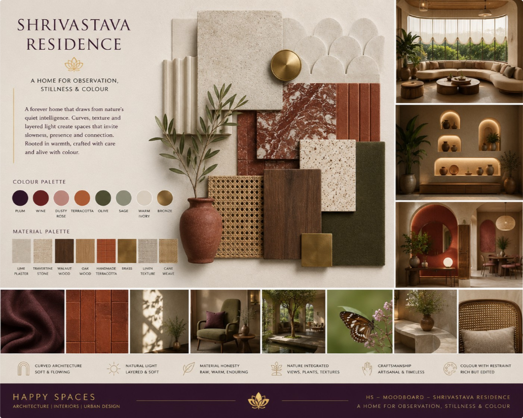
Five agreements with the painting.
The board is not a catalogue of finishes. These five agreements guide how its colours, textures and forms become a home.
Soft geometry
Arches, rounded niches and curved furniture carry the painting’s organic forms into the rooms. Edges feel grown rather than sharply cut.
Earth, then colour
Lime plaster, stone, oak and linen establish the base. Colour arrives selectively, as it does on the painted canvas.
Light that washes
Indirect light reveals texture and creates a setting for slow observation, rather than making decorative fixtures the focus.
Nature, not decoration
Framed views, integrated plants and natural stone make nature part of everyday experience, not an accessory added at the end.
Quiet luxury
Comfort, craft and material quality take precedence over display. Richness is present, but carefully edited.
Arrival in full colour.
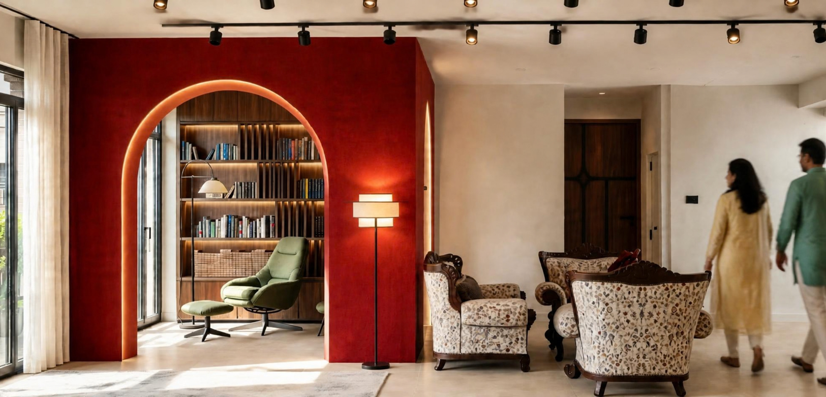
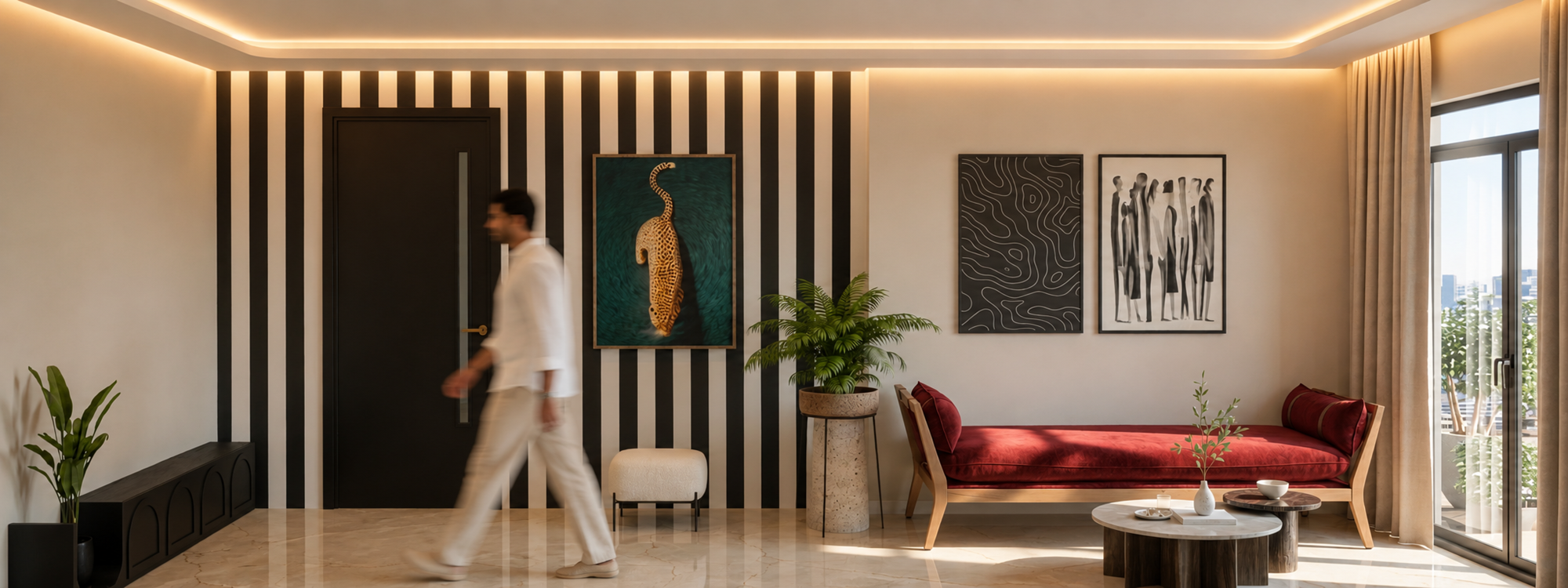
The front door opens into the bloom. The rooms for company take colour at full strength, each concentrating it in a different way.
The house-wide material vocabulary includes lime plaster, travertine, walnut, oak, handmade terracotta, brass, linen and cane. Each room draws selectively from it.
How we design a homeLiving room
Study beneath the arches
Dining room
Powder room
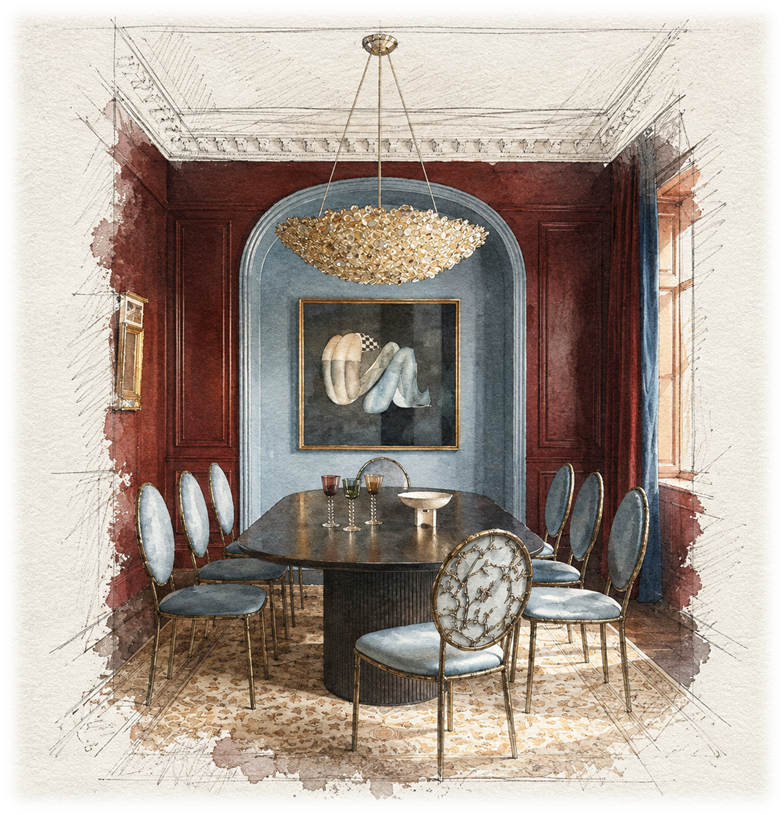
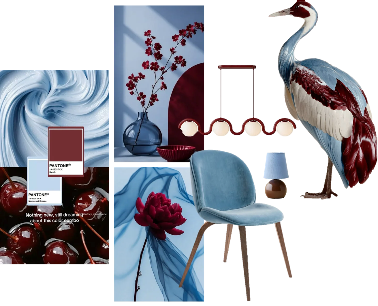
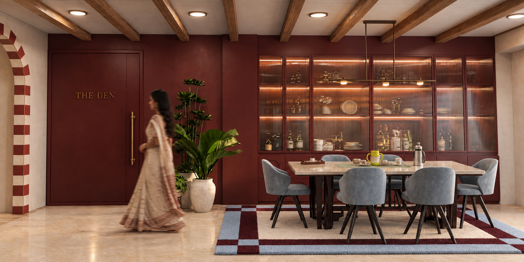
Maroon meets pale blue.
Moving from the living room into the dining area, we carry the maroon forward and introduce pale blue as its counterpoint. The deep warmth gives the room presence; the cooler blue brings air and balance, creating a regal setting without losing the intimacy of a family table.
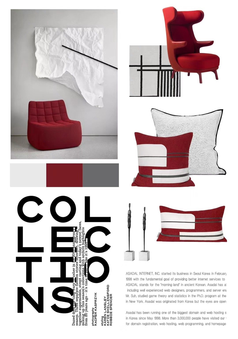
The watercolour explores that contrast around one table, while the collage gathers the colours, textures and sculptural forms that guide the dining room’s mood.
The house changes pace.
Past the gathering rooms, daily life shapes the mood. Cooking needs reach and useful light. Evenings need enclosure. The family’s rituals need somewhere the house can slow down.
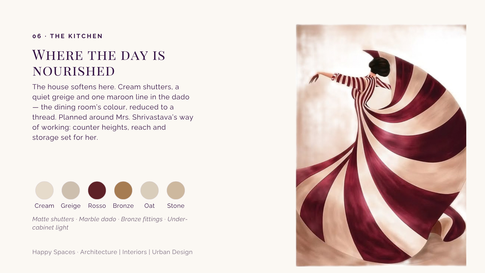
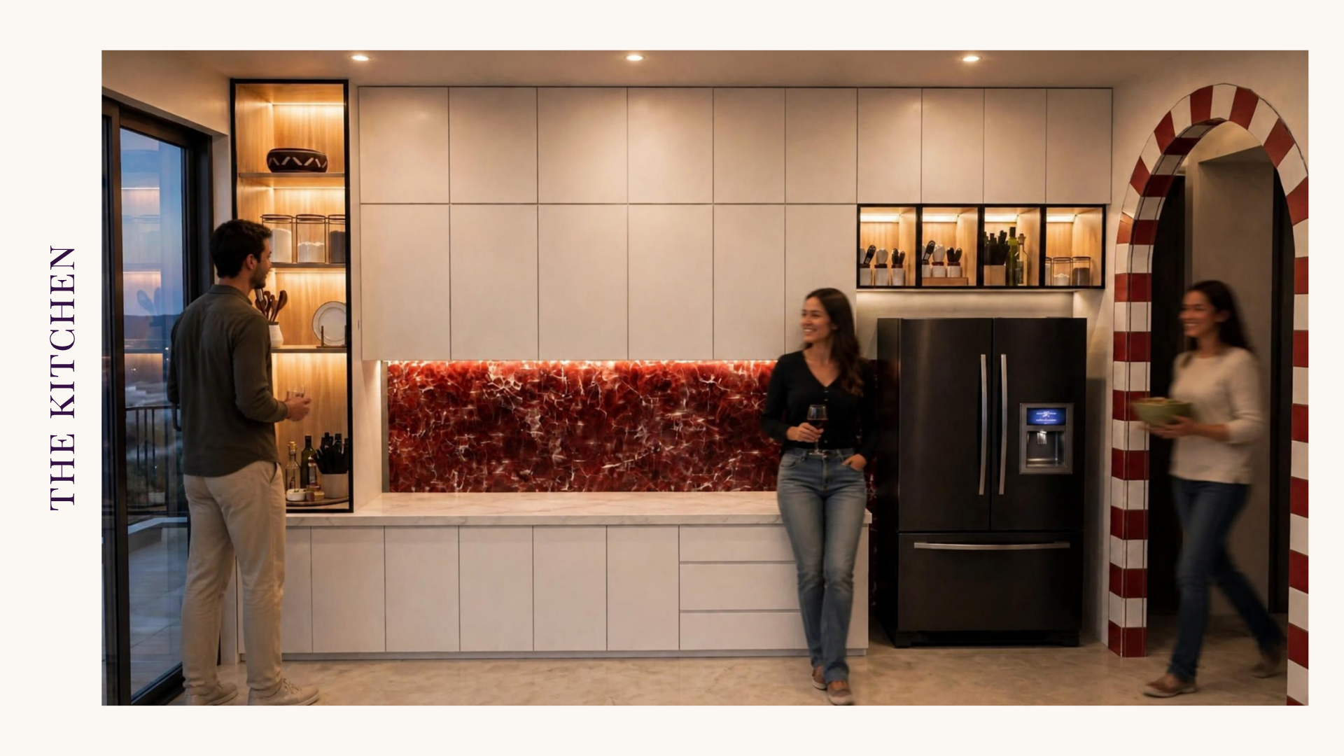
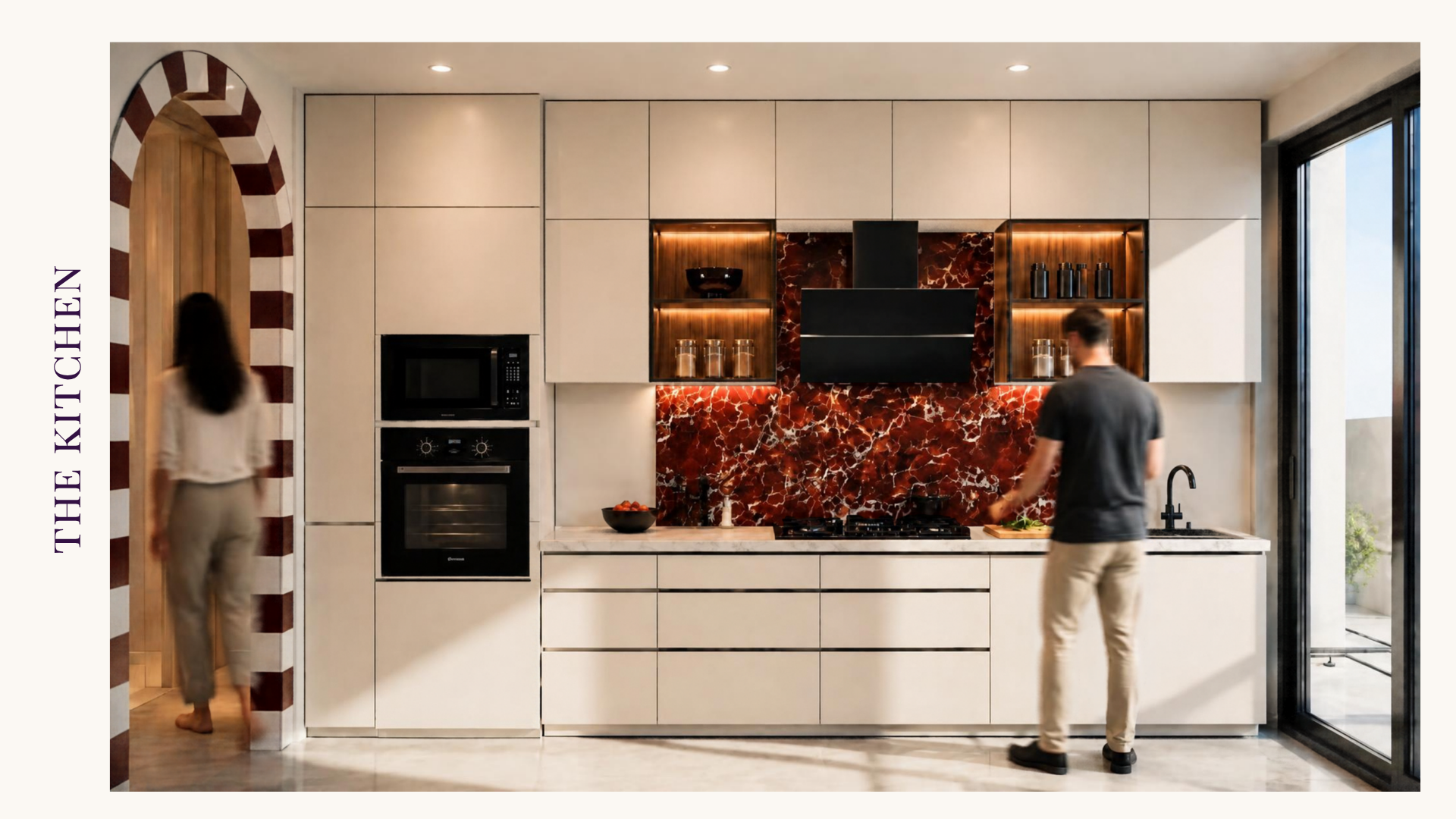
Kitchen: where the day begins
Cream shutters, quiet greige and a maroon line in the dado soften the dining palette. Counter heights, reach and storage are planned around Neeta’s way of working, with matte finishes, bronze fittings and under-cabinet light.
The Den: their private theatre.
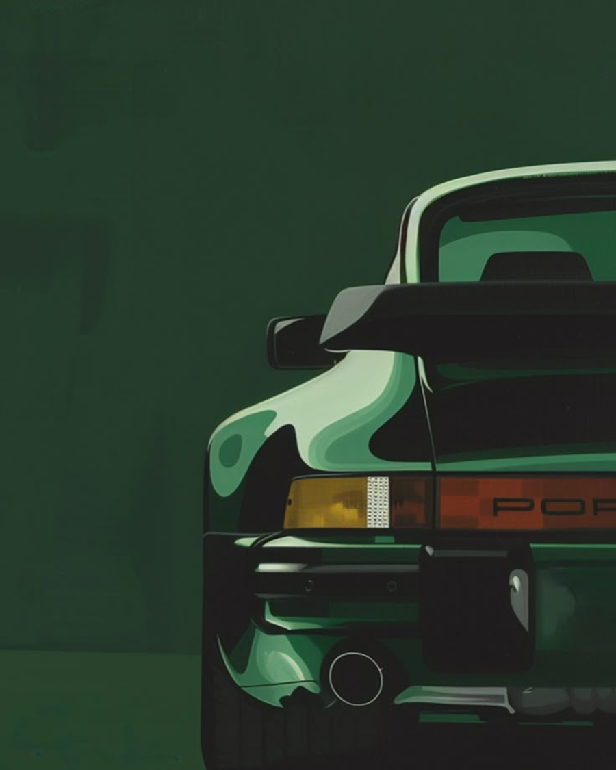
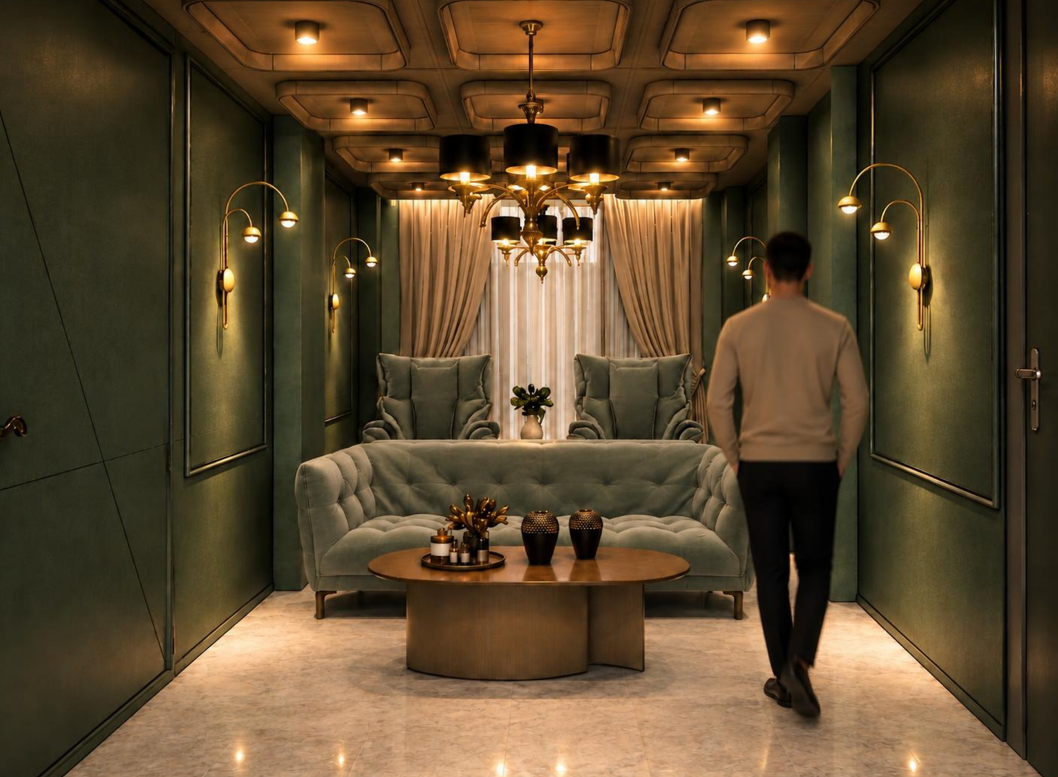
For a couple who love to linger over one more episode, THE DEN had to be the home’s most dramatic room, and its most loved. We imagined a royal theatre in miniature: deep green enclosing the evening, velvet welcoming them into their seats, and warm light settling softly before the story begins.
The lotus painting’s dark leaf finds its fullest expression here. Forest, moss and jade meet walnut, gold and smoke, drawing from the car reference’s rich greens and lustrous highlights. Acoustic fabric panels and scene-set lighting are proposed to soften distractions and make long evenings of watching feel intimate and immersive.
Velvet, acoustic fabric panels, walnut and scene-set lighting.
Family room: the still water.
Between the kitchen and the master bedroom, the home slows down. A puja brings space for devotion; a jhula is planned for the couple to enjoy their evening tea together, letting conversation linger with the gentle rhythm of the swing.
A pause, held in colour.
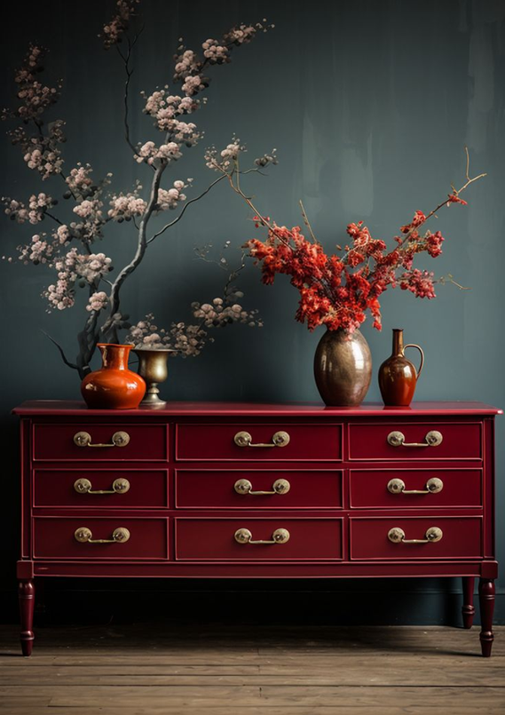
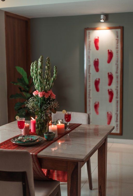
Like the still water beneath the lotus, this room holds the family’s quieter rituals. Teal lime plaster meets red lacquer joinery, while teak and aged brass add warmth; kumkum-print art gives the space a personal, devotional note.
Teal lime plaster, red lacquer joinery, teak, aged brass and kumkum-print art.
Here, the house goes quiet.
Past the family room, the private wing steps back from the rich arrival palette. The bedrooms and their adjoining baths are developed together, so each move into rest feels continuous rather than like a new decorative theme.
Pale blue for two
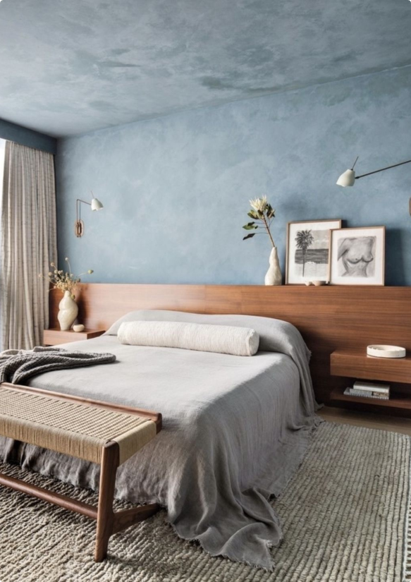
The master bedroom uses lime-washed blue across walls and ceiling, a long walnut headboard shelf, linen, wool and a sconce on each side.
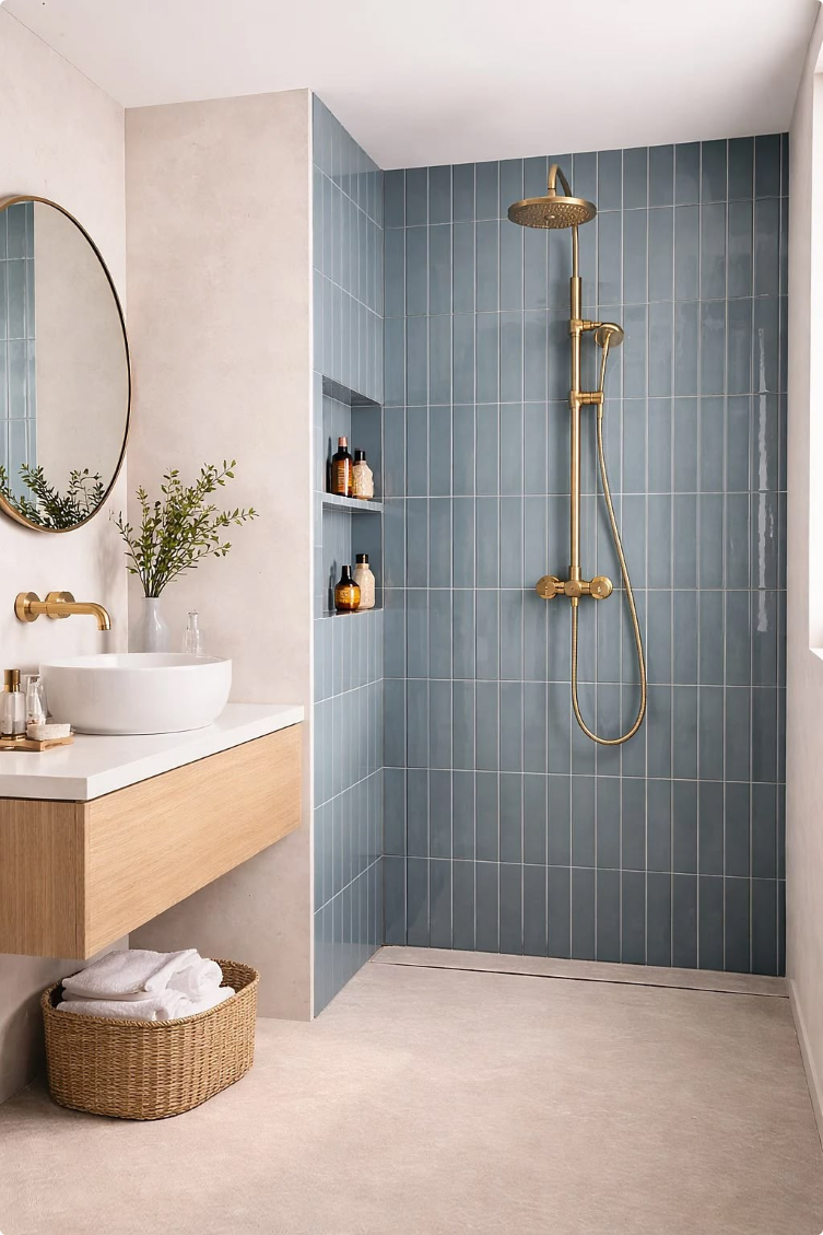
The blue continues into vertical glazed shower tile. Warm plaster, a floating oak vanity, brushed brass and a linear drain guide the bathroom design.
Glazed vertical tile, microcement, oak vanity, brushed brass and linear drain.
Sage, ready for the son
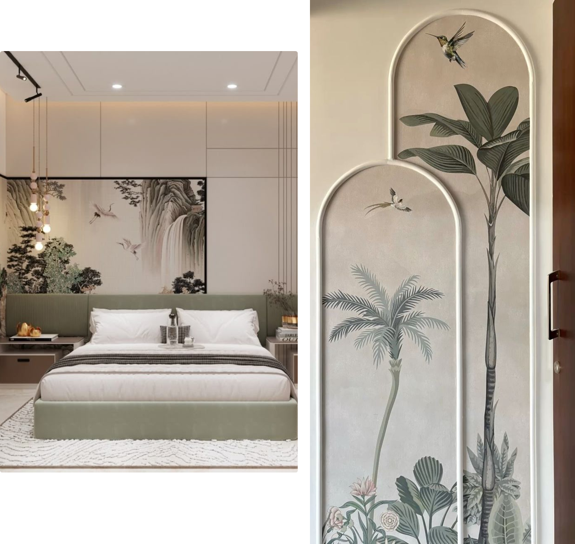
Sage upholstery and a painted landscape meet ivory panelling and warm taupe. A proper desk, power, data and screen-friendly light are planned around the son’s PC setup.
The bathroom takes the green deeper: fluted olive tile, warm grey stone, walnut, honed marble, brushed brass and lit niches.
Rose and clay for guests
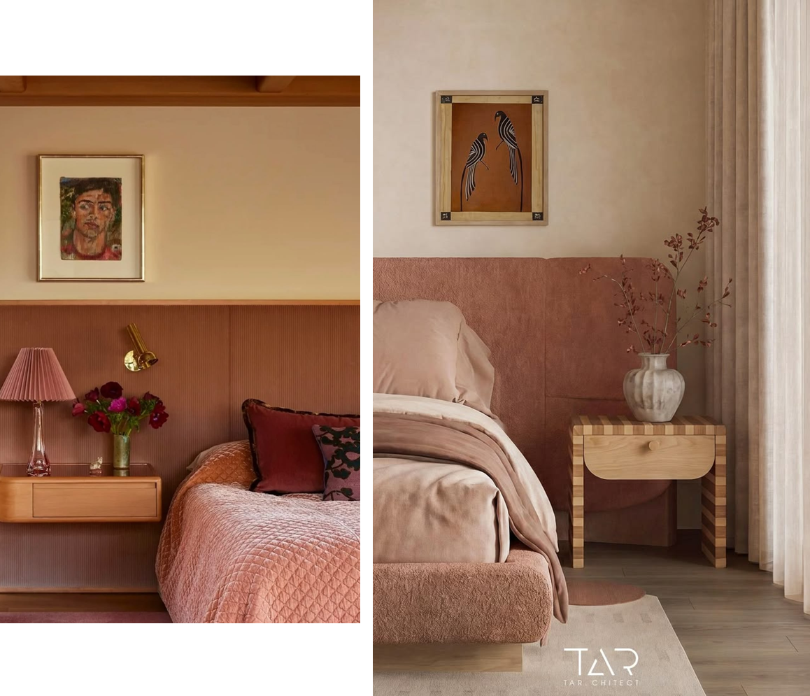
A dusty-rose fluted headboard, honey-oak nightstands, quilted velvet, bouclé and peach plaster create a warm welcome, with a brass reading light within reach.
A soft arch leads into a hand-glazed terracotta shower. Lime plaster, travertine, oak and an opal-glass light continue the room’s warmth into the bath.
Fluted upholstery, honey oak, quilted velvet, bouclé, lime plaster and brass.
Comfort planned for later life
Curbless showers, level thresholds and anti-scald valves are part of the proposed bathroom brief. In-wall grab-bar blocking in the master bath prepares for future support without treating accessibility as an afterthought.
From room palettes to specifications.
This is a design-development study, not a completed residence. The next stage includes family approval of the room palettes, a final material schedule, detailed kitchen and bathroom designs, and the remaining 3D renders.
Design renders and reference imagery illustrate the proposed direction, not completed-project photography.
 Made with Levo