Aug 4, 2026 · 7 min read
The Emotional ROI of a Better Arrival Sequence
Arrival is not a decorative moment. It shapes confidence, comfort, perceived value, and the way people judge a place before the main experience even begins.
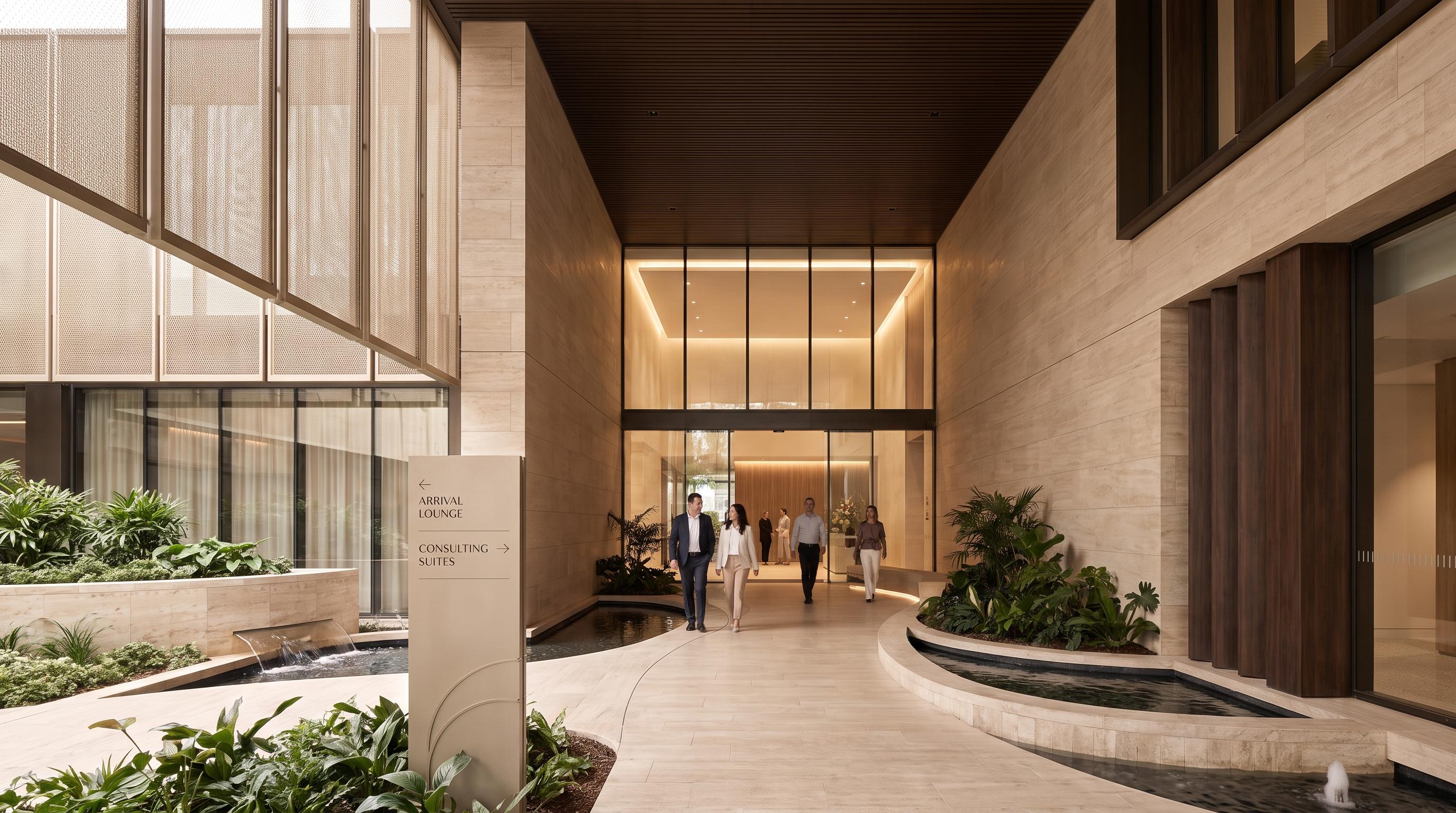
A better arrival sequence pays back before the main experience begins
The emotional ROI of a better arrival sequence is simple: it reduces uncertainty early, lowers stress, and makes the rest of the place feel easier to trust. Before a resident reaches the clubhouse, before a guest gets to the room, before a family assesses a senior living community, and before a visitor settles into a workplace, the entry sequence is already shaping perceived value.
That is the direct answer to the headline question. Arrival is not a decorative preface or a lobby-styling exercise. It is emotional infrastructure: the approach, threshold, first sightlines, waiting moments, sound, lighting, and orientation cues that tell people whether this place feels calm, clear, and competently run. That is also where this topic differs from most generic search results. Too many treat arrival as a visual flourish. The stronger view is that arrival affects cognition, confidence, and behaviour.
Research on first impressions helps explain why this matters. In a classic study, Lindgaard et al. (2006) found that people form visual impressions in as little as 50 milliseconds. That study was not about buildings, but the lesson is still useful: people begin judging environments almost immediately.
Arrival shapes first judgment. People decide quickly whether a place feels legible, warm, and worth their attention.
Arrival shapes emotional readiness. Reduced friction makes people more open to what comes next.
Arrival shapes commercial interpretation. A clearer, calmer sequence can make the same project feel more premium and more trustworthy.
Why arrival changes judgment so quickly
People do not judge arrival in fragments. They experience the approach, threshold, orientation, and waiting moment as one connected sequence. In service environments, that matters because the physical setting shapes how people feel and behave inside it. Mary Jo Bitner’s foundational servicescape research argues that surroundings influence emotion, interpretation, and action, which is exactly why an entry sequence can strengthen or weaken everything that follows.
In practical terms, people are asking fast, mostly unspoken questions: Where do I go? Am I in the right place? Is this waiting moment comfortable? Does this place feel calm, competent, and considerate? If the sequence answers those questions well, confidence rises. If it creates hesitation, glare, noise, or ambiguity, the project loses emotional ground before its main spaces have had a chance to perform.
Where the ROI shows up in real use
The return on arrival is not only aesthetic. It shows up in how people move, judge, and settle.
Higher perceived value: an arrival that feels coherent and easy makes the whole project feel more considered.
Lower friction: better thresholds, sightlines, and cues reduce unnecessary stopping, scanning, and asking for help.
Stronger trust: calm, legible entries signal competence and operational maturity.
Better memory: people are more likely to remember a place positively when the opening minutes lower stress rather than raise it.
There is also a useful operational analogy from healthcare. A widely cited evidence review from The Center for Health Design, summarizing Zimring’s wayfinding research, estimated that poor wayfinding could cost a hospital more than $220,000 per year, including over 4,500 staff hours spent giving directions, or about $448 per bed per year. The sectors are different, but the principle transfers cleanly: when buildings are hard to read, people pay for it in time, stress, and trust.
What weak arrival still looks like in real projects
Weak arrival usually fails as a sequence, not as a single object. The problem is rarely one bad sign or one wrong material. It is that the whole transition asks too much from people too soon.
The entrance looks impressive but the true entry point is unclear.
The threshold feels formal or exposed instead of easy to enter.
The waiting moment feels awkward, overlit, noisy, or under-supported.
Sightlines are dramatic but not actually helpful.
Signage exists, but orientation still feels effortful.
The sequence moves people through quickly without helping them settle emotionally.
Those issues make spaces feel colder, more performative, or less premium than intended. People may not describe the problem in design language, but they still feel it.
What research says about stress, wayfinding, and recovery
Better environments do more than look better. They can change stress and behavioural outcomes. Roger Ulrich’s classic 1984 study found that post-surgery patients with a view of trees had an average stay of 7.96 days, versus 8.70 days for patients facing a brick wall. That is not an arrival-sequence study, but it is strong evidence that environmental conditions affect more than mood.
Wayfinding research points in the same direction. A 2022 HERD study by Qi, Lu, and Chen found that better environmental cues, including landmarks and outdoor window views, improved wayfinding performance and reduced stress in a healthcare simulation. And a 2022 long-term care study by Davis and Calkins showed that complex layouts, long corridors, and weak visual connectedness make independent movement harder in later-life settings.
That matters here because arrival is where spatial legibility starts. If the first sequence already creates uncertainty, the rest of the environment has to recover from it.
Why generic “sense of arrival” advice is incomplete
The better differentiator is not spectacle. It is reduced cognitive load. Generic search results usually talk about arrival as grandeur, identity, or ambience. Those things matter, but they are incomplete. The more useful question is whether the sequence helps people understand what to do next without strain.
That is especially relevant in premium residential, hospitality, senior living, and workplace settings. In these sectors, emotional readiness affects how people interpret value. A project can look expensive and still feel tiring. It can look polished and still feel uncertain. It can make a strong visual statement and still underperform in trust.
For a wider wellbeing lens, see the Happy Space Framework and the design levers collected in Places.
The design moves that improve arrival most
Better arrival is built through specific spatial decisions. The highest-payoff moves are usually straightforward.
1. Make the threshold readable
The transition from outside to inside should feel obvious and calm. People should not need to decode where the real entrance is or what happens next.
2. Reduce cognitive load early
Clear sightlines, visible destinations, restrained choices, and simple route logic do more work than decorative signage alone.
3. Design the waiting moment
Micro-waits matter. Security, concierge, lift calling, and check-in all need comfort, dignity, and visual reassurance, not leftover planning.
4. Tune sensory comfort
Lighting, acoustics, air, temperature, and material tone decide whether the entry feels generous or tiring. The World Green Building Council and the WELL Building Standard both treat comfort conditions as core to wellbeing, not optional extras.
5. Use landmarks and wayfinding before adding graphic fixes
Arrival works best when the plan, landmarks, and zoning already help people orient themselves. That is the principle behind stronger wayfinding in related Happy Spaces posts, even where this article stays focused on arrival itself.
Questions worth asking before sign-off
A better review asks what the user feels, not only what the plan shows. These questions usually expose weak arrival fastest.
Can a first-time visitor tell where to go without effort?
Does the sequence lower stress or increase it?
Is there a clear transition from public edge to interior experience?
Do waiting points feel dignified and comfortable?
Does the sensory atmosphere match the project promise?
Would the sequence still work if the decorative layer were simplified?
Key takeaways
Arrival sequence ROI is real: it shows up in confidence, trust, and perceived value before the main experience begins.
Fast judgment matters: first impressions form quickly, which makes the opening sequence commercially important.
Concrete numbers help ground the case: 50 milliseconds for first visual impressions, 7.96 vs 8.70 days in Ulrich’s recovery study, and more than $220,000 a year in wayfinding-related hospital costs in the healthcare evidence review.
The strongest angle is not styling: better arrival works because it reduces cognitive load and stress.
Thresholds, sightlines, waiting moments, and comfort conditions usually matter more than adding more visual drama.
Why this matters commercially
Arrival helps people decide how generous to be with the rest of the project. When the opening experience feels calm, legible, and confidence-building, people interpret the place as more thoughtful and more valuable. When it feels awkward or effortful, the rest of the project starts from a weaker position.
If your entrance looks resolved but still feels uncertain in use, it is time to review the sequence more closely. Start a project with Happy Spaces to assess welcome, comfort, clarity, and confidence across the full arrival journey.
Frequently asked questions
What is an arrival sequence in architecture and interiors?
An arrival sequence is the connected experience of approaching, entering, orienting, and settling into a place. It includes the route in, thresholds, first sightlines, waiting moments, sensory cues, and the first decisions a person has to make after entering.
Why does arrival matter so much to perceived value?
Because people start judging a place before the main experience begins. If the sequence feels clear, calm, and well considered, the whole project is more likely to feel trustworthy and premium; if it feels confusing or emotionally flat, that weakens the rest of the experience.
What makes generic arrival advice incomplete?
Most generic advice focuses on atmosphere, branding, or visual drama. The bigger issue is whether the sequence reduces cognitive load, helps people orient themselves quickly, and lowers stress in the first few minutes.
What usually improves an arrival sequence most?
The biggest gains usually come from better threshold clarity, more intuitive wayfinding, calmer waiting moments, stronger sensory comfort, and clearer destination cues. Those changes are often more valuable than adding decorative complexity.